


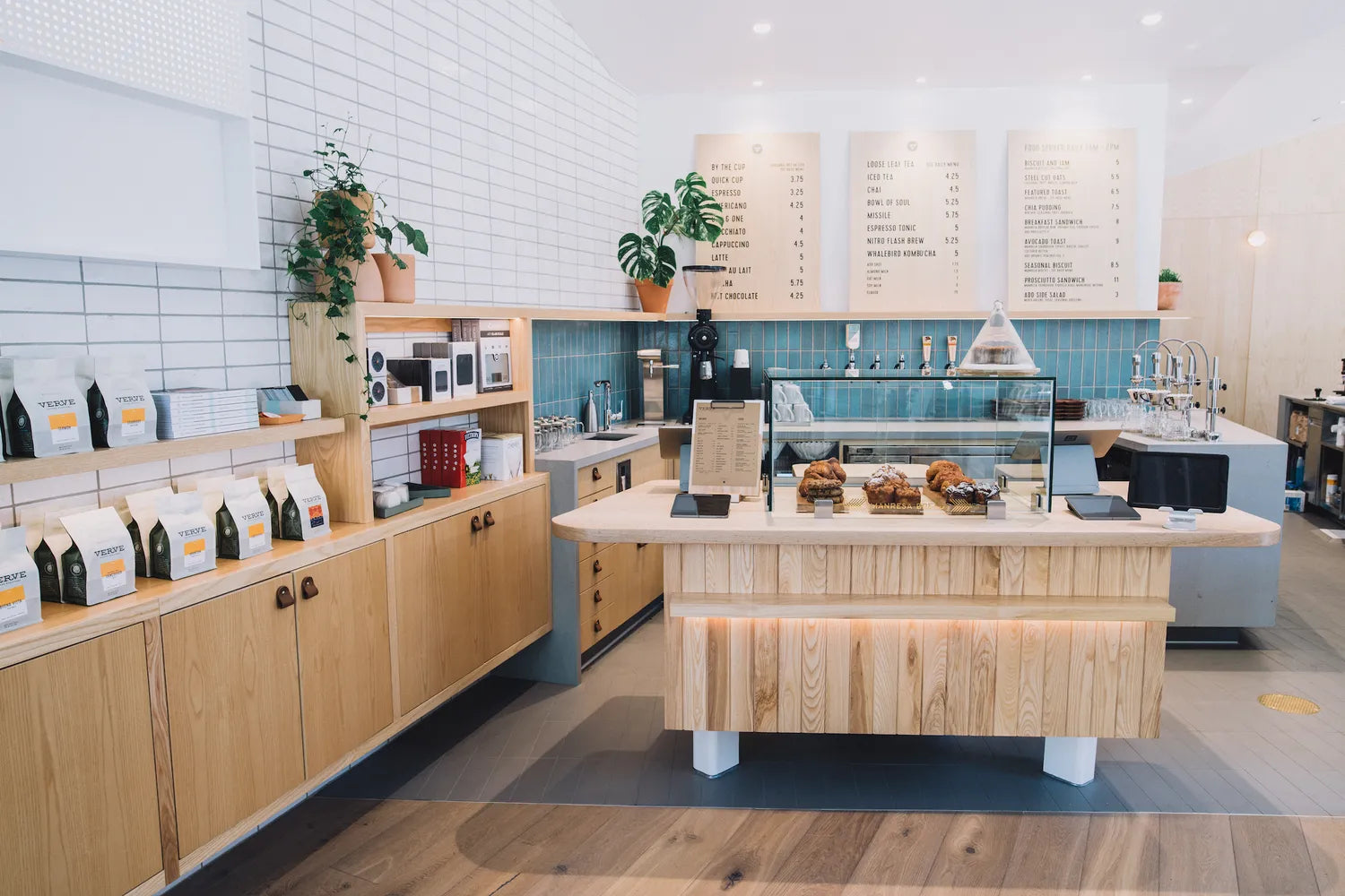
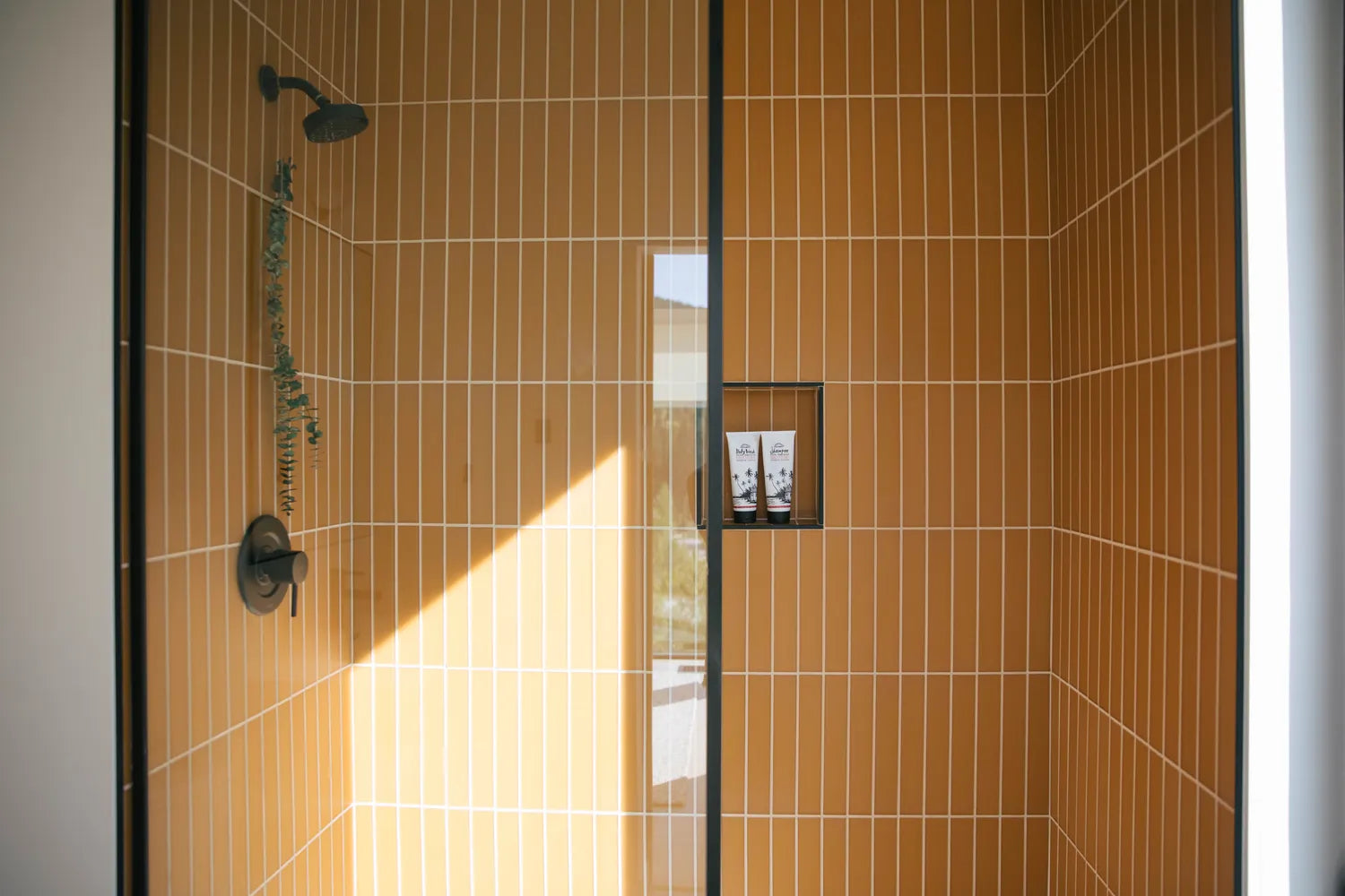
Thoughtfully layered textures like light wood finishes and rustic Glazed Thin Brick in Lewis Range, Olympic and Allegheny lend Verve Coffee Roasters an earthy yet ever-so-airy atmosphere (please note, Allegheny has since been discontinued). We caught up with designers Brian and Meghan of Young America Creative (YAC) to learn more about this Palo Alto coffee spot. Keep scrolling for our full interview!

Brick Shown: Olympic, Allegheny (discontinued), Lewis Range // Design: YAC // Photos: Lauren Edith Andersen
About YAC:
Young America Creative/YAC has an office in both Santa Cruz & Oakland, California. Typically we do approximately a 50/50 mix of residential and commercial work but in 2019 almost all of our completed projects are restaurants/bars/coffee shops.
Check out YAC's other Fireclay Tile project spotlight, Roses' Taproom

YAC creators, Meghan Dorrian and Brian Friel
Fun fact about yourselves?
Brian and I grew up in Santa Cruz and went to high school and college together, but really what kicked off our friendship (circa 2000) was working in a restaurant together. Little did we know that would lead to a career in restaurant design but it’s definitely not a coincidence!
How did you get involved with Verve Coffee?
Verve Coffee is a fellow Santa Cruz based business. Shortly after East End Tap was completed, one of the founders of Verve had a meal there and reached out to us about remodeling their original store on 41st Ave (which also features Fireclay Tile!). The Palo Alto location is our second complete build-out we have done with them.

How involved were your clients in the design/build process?
Colby and Ryan, the two founders of Verve, plus their greater team are embedded in the design process and buildout - they are great collaborators. They are very interested in design in general and approach store construction with the same level of care and attention to detail as their coffee production. The quality of materials used and an interest in craft/technique all translate to the process of designing and opening a new store.

What's important to you when designing commercial spaces, such as a coffee shop?
Where to start! Coffee shops are deceivingly tricky. The flow of a coffee shop is critical to the success of the business and the customer experience. There are a lot of people that work at a cafe and efficiency is key. Fitting all of the equipment in, much of which is bulky and some of it unsightly in a small space that has clean lines and looks organized is challenging and fun. Knowing that Palo Alto was going to have quite a lot of foot traffic, an unfathomable amount of discussion went into the analyzation of the flow of the customer queue and pickup areas to try to negate bottlenecks and human traffic jams without making you feel like you are at the airport.

What was the space like when you started?
The space was previously a skate shop. The ground floor is a retail space in a building that has some famous tech history upstairs and is one block from the Caltrain station in downtown Palo Alto.

Verve liked the space because of it’s great corner location, sun exposure, and the adjacent plaza which was also re-imagined and rebuilt simultaneously. The space however, is a strange shape with an angled wall, and a bit smaller than Verve needs, so an incredible amount of design work went into making sure the flow of the cafe worked as efficiently as possible. In addition to removing and replacing the entire storefront, we also relocated one set of doors to allow for more optimized circulation and included a large operable fleetwood window that opens up to the exterior garden.


What type of look or aesthetic were you going for?
For this store we were aiming for a Scandinavian meets California vibe. We were keenly aware of the incredible advantage of having southern exposure and oriented the whole cafe to face the southern facade and the patio. We wanted to embrace the bright, near perfect weather of Palo Alto on the interior. All of the wood tones are on the lighter side; using Ash for all the cabinetry and tables and Oak for the flooring. Oak Muuto chairs with their ‘dusty rose’ powder-coated legs was our gesture to the traditional terracotta tones of older Palo Alto Spanish styles.

How did you come up with your color scheme and design? How did you settle on the Glazed Thin Brick in Lewis Range, White Mountains, and Allegheny?
The Lewis Range white brick wall was in the design from day 1. As part of the aim to make the space bright and welcoming, we wanted a more reflective material than the more matte tile we often spec. Everyone really liked the texture that the brick brings to the palette, making the space feel more activated as the light is able to bounce around a little more than say a painted wall. To increase the aim for reflectivity and variation, we mixed in 10% of Olympic, which is the more glossy and crackled finish to the mix. I am sure no one will ever consciously notice this but I think it makes all the difference.

There is a datum shelf that runs throughout the back bar of the cafe, around to the food prep zone. The Allegheny brick lives three bricks vertically stacked between the top of counter and the underside of the Ash datum shelf. The Allegheny was identified as required for the project very early on. I think we accidentally brought it! It didn’t have an intentional place in the material palette initially and we had no specific location/plan for it, but it was identified as something that MUST be included. For no actual reason except that everyone was obsessed with the color and depth that finish has, we ended up designing the entire space around this one finish. As a designer it’s very helpful to find one material that everyone is behind; it helps all the other materials fall into place and almost acts as a ‘sounding board’ for other ideas.
[Please note that Allegheny has been discontinued. See more of our brick options here.]

We knew we wanted to use the Allegheny sparingly so that it would be more of a feature, or the one accent to the otherwise very muted natural material palette; it’s practically the only color in the space.
How did the installation process go?
We decided to go with the same exact grout on both the Lewis Range and Olympic white bricks and the Allegheny. You would never know because the way the glazes play off of the grout they don’t look the same but they are! The grout is a warmer gray/beige tone, and really speaks well with the warmer wood tones nearby.

This was our first time working with Fireclay Brick and loved the result that the thicker product yields. There is more variation in the surface because of the length of the bricks and firing process and it has a more commanding/anchoring presence in the space because of this.
What's the biggest lesson when it comes to design that you've learned over the years?
Keep on going. The red tape and daily minutiae can be a real buzz kill, but we try to find the core idea behind each project and stay as focused as we can on seeing an atmosphere take shape.

What keeps you inspired? Where do you look for design inspiration?
It’s so ironic but architects in general seem to favor being outdoors more than indoors, even though we build enclosed spaces most often. So much of our design inspiration comes from being on the ocean and walking in the forest.
What Fireclay products are you dying to use in future projects?
I have been obsessed with the Agrarian Collection for a long time and can’t wait to use the Harvest/Pivot/Aerial tiles in the right project.

What's your favorite thing about Fireclay Tile?
Our favorite thing about Fireclay are the rich glazes, deep tones, and variation in the tiles that reflect the chemistry behind firing.

What are your 3 best design tips?
#1 Invest in the best materials you can for the problem you are solving. Materials that bring joy, match the durability you require, and feel right to touch.
#2 Trust your designer- Designers work 100% of the time, waking and sleeping, eyes are always open, always studying, always solving problems. Our idea of a vacation is a tour of a famous building. The dedication to the craft is a commitment to constantly keep learning.
#3 Consider light & atmosphere- Natural or introduced, lighting is key, especially in commercial projects.

Check out more of Brian and Meghan's work on their website, and if you're in Palo Alto, don't forget to visit Verve Coffee Roasters!
Need some help on your own project? Simply call, chat or fill out our Design Assistance Form and one of our talented Design Consultants will get back to you shortly.