


Designer Anne Sage doesn't see the world as either bold or boring. In fact, it's in the neutral tones in between where she finds inspiration for her eye-catching style that's dawned a magazine, book, and a fanatic following over her 13-year career. From drawing out the subtleties of handmade tile to redecorating with the elements you already own, Anne's pared-back approach to design is refreshing and thoughtful. So we sat down to get her thoughts on design, tile and using neutrals to nail your vision.
Peaceful, intentional, and subtly playful, Anne's self-described style is captured in her Fireclay favorites. Featuring ceramic colors in Sand Dune, Gypsum, Carbon, Pumice, and Brick colors in Elk, Olympic, Lewis Range, and Black Hills.

Meet Anne Sage!

Can you tell me a bit about yourself and what you do? How did you get your start in design?
I grew up around design! My mom and both my grandmothers were seriously into interiors, and I grew up helping them with projects like wallpapering and sewing curtains. I can still remember trips to the Laura Ashley store in the ’80s, and the chintz/stripe/pin-dot combo we chose for my childhood bedroom!
As far as my career path goes, after getting a degree in English at Stanford, I went to New York to study interior design at Pratt. However, I left after 8 weeks because I was tired of being a broke student and just wanted to get a job! I found work as a consumer strategist at an ad agency, but my dream was to work at a design magazine—and when I couldn’t get a foot in the door anywhere, I started my blog. I used it to hone my eye for design and also build some incredible relationships, not only with brands that I respect and admire but also with fellow design enthusiasts the world over.

Brick Shown: Olympic Brick with 6x12 tiles in Gypsum
13 years later, I’ve co-founded an online lifestyle magazine, written an interiors book, grown an engaged Instagram following, and built a small but steady design client practice. I feel really lucky that I’ve been able to carve my own path that allows me to surround myself not only with great design but with fellow design lovers!

Tile Shown: Elk Brick
What made you choose the 8 colors in your palette?
One of my favorite things about Fireclay Tile, in particular, is how incredibly dynamic the finishes on the tile are, and each of these colors that I selected illustrates that dynamism so beautifully. Yes, they’re neutral hues, but when you see them installed en masse you get a true appreciation for the depth of color in each glaze, the subtle variations, and the way that they catch the light for a unique and captivating effect.

Brick Shown: Olympic Brick with 6x12 tiles in Gypsum
Why do you love tile?
Tile truly does represent the idea of infinite possibility in design! I love that you could take one tile shape and color and give it to ten different people, and ten different installs could result depending on the pattern they chose, as well as the grout color and thickness they chose. It’s the ultimate tool for self-expression that also happens to be functional, too!

Tile Shown: Fallow and Grange in Custom Motif
Do you have a favorite tile moment from all of your projects?
That’s so hard! It’s like asking me to choose a favorite child!
How would you describe your aesthetic?
I’d describe it as peaceful, intentional, pared-back, and subtly playful. I love neutral hues, clean silhouettes, and utilitarian materials, but I also can’t resist cheeky accents like polka dots or whimsical art.

Tile Shown: Handpainted Aerial in White Motif
Where do you draw inspiration from?
I draw a ton of inspiration from commercial design—I love seeing the creativity that happens in a restaurant, hotel, and retail design. Before the pandemic, we were really lucky here in LA to have so many exquisite experiential spaces opening all the time. In the last year, I really missed the energy and excitement of going out to dinner at a just-opened restaurant, or doing an overnight at a new hotel, and appreciating all the forward-thinking design details. (I think my husband probably doesn’t miss going out and watching me take photos of everything instead of paying attention to him, though!)

Tile Shown: 6" Triangles in Calcite // Design: Sarah Sherman Samuel // Image: Jeff Mindell
What are your 3 best design tips?
1. Color is one way to create interest and excitement in a space, but it’s not the only way! I love decorating with a neutral palette because it forces me to employ other elements in the design toolbox. Incorporating a range of textures, finishes, and patterns into a space while keeping the color palette quiet makes for a room that’s richly layered and full of personality.

Tile Shown: 6x12 tiles in Gypsum
2. Time and patience are your best friend when it comes to decorating. So often I’ve seen clients make purchases that they end up regretting and returning, simply because they thought they needed to check all the boxes on their shopping list right away. The truth is that many of a house’s quirks and use patterns won’t reveal themselves until you’ve lived in it for a while. And while the design is about making a home that looks great, it’s also about making a home you’re comfortable living in. It’s an evolution, and it can’t be rushed!

Tile Shown: Handpainted Aerial in White Motif
3. Embrace the idea of decorating from within your own home. (I think a lot of us really ran with this one during COVID!) I’m constantly moving things around, styling new vignettes using the same pieces over and over again, and rearranging furniture to foster a fresh look without spending a dime. It can be fun to buy new things, but there’s also so much satisfaction to be had in taking things you already love and finding ways to see them in a new light!

Tile Shown: Handpainted Aerial in White Motif

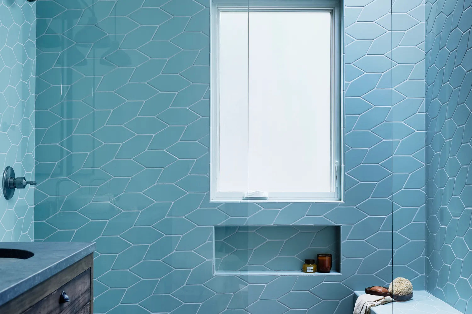
Tile Shown: 1x6 Mosaic Tile in Sand Dune and 6x12 in Adobe
What are the best ways to use neutrals in the home?
Remember that neutral doesn’t have to mean monochromatic! For example, in years past we saw a lot of spaces that used single wood tones throughout, but lately I’m loving a mix-and-match vibe when it comes to incorporating wood finishes. In kitchens, I love the look of a walnut island with white oak upper cabinets. And in bedrooms, don’t feel tied to the coordinating bed/dresser/nightstand set. I recently did a bedroom with honey oak nightstands and a dark-meets-light cerused wood dresser, and it turned out beautifully!

Brick Shown: Elk Brick
That said, I never say no to a beautiful monochromatic space. If you’re choosing to go tone-on-tone, consider what other elements you can play up for an eye-catching look. Explore fun shapes (curves and rounded edges are having such a great moment!) or bold proportions. Handmade tile makes for beautiful monochromatic installs because even though the color may be the same throughout, the minute variations in each tile make for a sense of movement that is captivating.

Tile Shown: Olympic Brick with 6x12 tiles in Gypsum
Can you tell me a bit about your design process? What is your favorite part?
I spend a lot of time laying the groundwork and getting a clear vision for the project, determining the aesthetic vision as well as the functional needs by asking the client a lot of questions and gathering a ton of reference images. (In college, I was always the kid spending hours in the library researching before starting my essay!) I’ll then sit on everything and let it percolate. I find that the problems of a given project often solve themselves in the back of my head, and then pop forth at inopportune times like when I’m lying awake at 3 am worrying about something else altogether!

Tile Shown: Handpainted in Aerial in White Motif
Sourcing is definitely one of my favorite parts. I love the thrill of the hunt! And while I’m willing to go anywhere and everywhere to secure just the right piece, I also find it helps to have go-to’s when it comes to materials sourcing. Otherwise, it’s easy to feel overwhelmed by the millions of brands and companies out there. Fireclay is at the top of my speed dial for tile, obviously!
You've used our tile in your own home + for client projects--any tips on working with handmade tile?
If you’re planning on installing it yourself, be prepared to call upon your patience! Because no piece of handmade tile is identical to the next, those with a type-A personality may find themselves triggered, ha! (I speak from experience, as my first Fireclay install was one I did myself, and setting the pattern layout was definitely an act of embracing the perfection of imperfection…)

Tile Shown: 6" Triangles in Calcite // Design: Sarah Sherman Samuel // Image: Jeff Mindell

Tile shown: 1x6 Mosaic Tile in Sand Dune and 6x12 in Adobe
And if you’re hiring a pro to do it? Plan for the tile installs to take up a significant chunk of your budget (and your timeline, depending on the total square area you’re tiling, as well as the intricacy of your design). Know that it’s worth paying a more highly skilled tradesman to get a successful finished result! This is particularly true if you’re planning on a stacked install as opposed to an offset install. It takes an experienced (translation: more expensive) installer to get really clean grid lines from handmade tile.

Tile Shown: Fallow and Grange in Custom Motif
Lastly, any colors, shapes, or patterns of ours you'd love to use in future projects? I’m DYING to use Cardamom for something. The crackle detailing and color variations along the edge of each tile has a timeworn look that feels mysterious and alluring. I also really want to use Brick on a floor; I’ve used it for walls a few times and it’s got a tactile weightiness that begs to be felt underfoot!

Tile Shown: 3x6 in Cardamom
Love's Anne's style? Sample her favorite neutrals, including Sand Dune, Gypsum, Carbon, Pumice, Elk, Olympic, Lewis Range, and Black Hills Brick.