


Architecture // Design // Images: Project M Plus
With luxe touches, thoughtful details and tile-a-plenty, Jayde's Market, dreamed up by Project M Plus, is what we all wish our local grocery store looked like. A Los Angeles–based collective of designers and architects, Project M Plus is a 360 full design and architecture firm that provided, "a comprehensive identity from logo to architectural renovation to interior design" for this swoon-worthy market. We talked with them about their firm, the design, plus all of the tile (there is a lot--which we love) and more below:
First, can you tell me a bit about Project M Plus? How did you get your start? What sort of projects do you typically work on?
We are a 360 full design and architecture firm located in the Silverlake neighborhood of Los Angeles, CA. Started by husband and wife team, McShane (Principal Architect) and Cleo (Creative Director) built a talented team of architects, interior and graphic designers, and copywriters to provide holistic design services to Southern California.
Jayde's Market went through quite the transformation; what was your role in the project?
M Plus was sought out by the Jayde's Operations Consultant, New School LA, to provide a comprehensive identity from logo to architectural renovation, to interior design, engaging the entire M Plus team to work collaboratively on creating a family owned gourmet community market.
What was the overall aesthetic you were going for in the space?
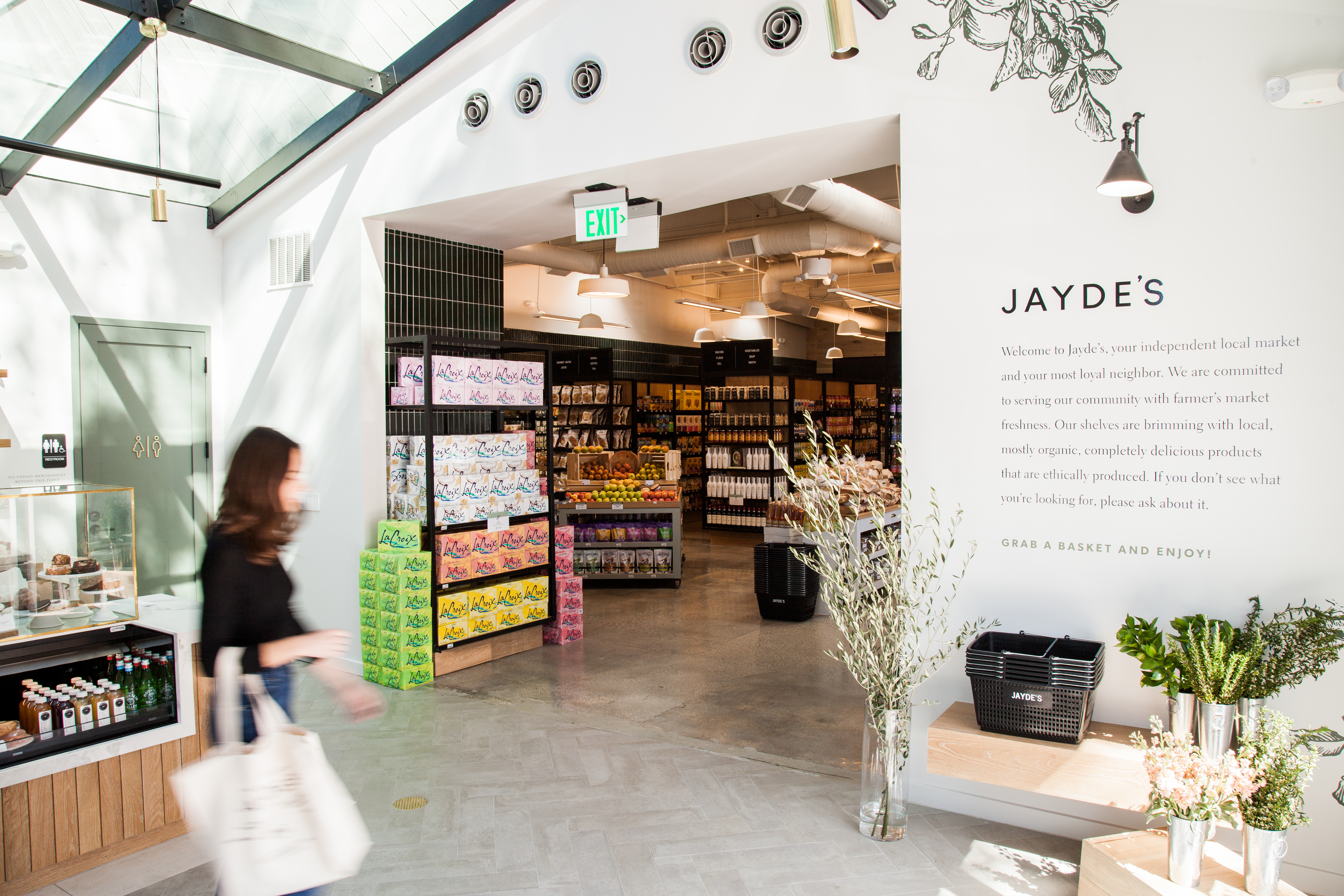
Located in the Beverly Glen hills and about 20 to 30 minutes to the nearest grocery store, the market is as a hub for the community offering high-quality products for all of your daily shopping needs, in a similar fashion to the curated, urban European markets. Much of the aesthetic is derived from a modern representation of the quaint English marketplaces.


Tile Shown: 2x8s straight set in a custom green
There is a lot of tile throughout the market (which we love)--what made you decide to use ceramic tile over another material?
Tile is very versatile and can be an elegant way of incorporating texture, color, and pattern specifically curated to the design thread. As the concept was derived from the English marketplace, where you see a lot of cobblestones, and brick architecture, the elongated brick shape was a natural choice. Laid in a vertical straight set pattern, we retained the nod to classic style with a more clean-lined, modern look.

Let's talk about the custom green tile first. You worked with our team to develop this color, what was the inspiration? Can you tell me about the experience?
The ethos of the Jayde's brand is to provide the highest-quality ingredients for their guests. As such, the interiors of the market should reflect the freshness and quality of its products and what better way than to play off the vibrancy of the produce. Through a couple rounds working with the Fireclay team, we developed a signature Jayde's Green that is also carried into the branding.


Want a close match to this saturated green? Try our Evergreen or Venetian Green:

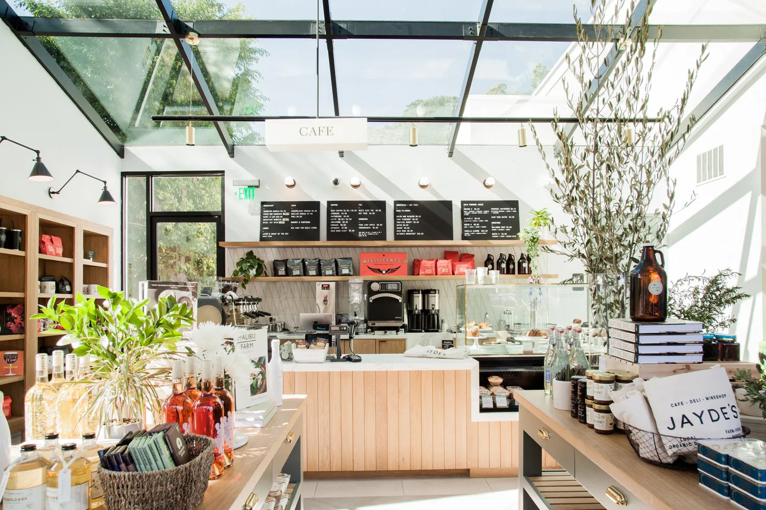
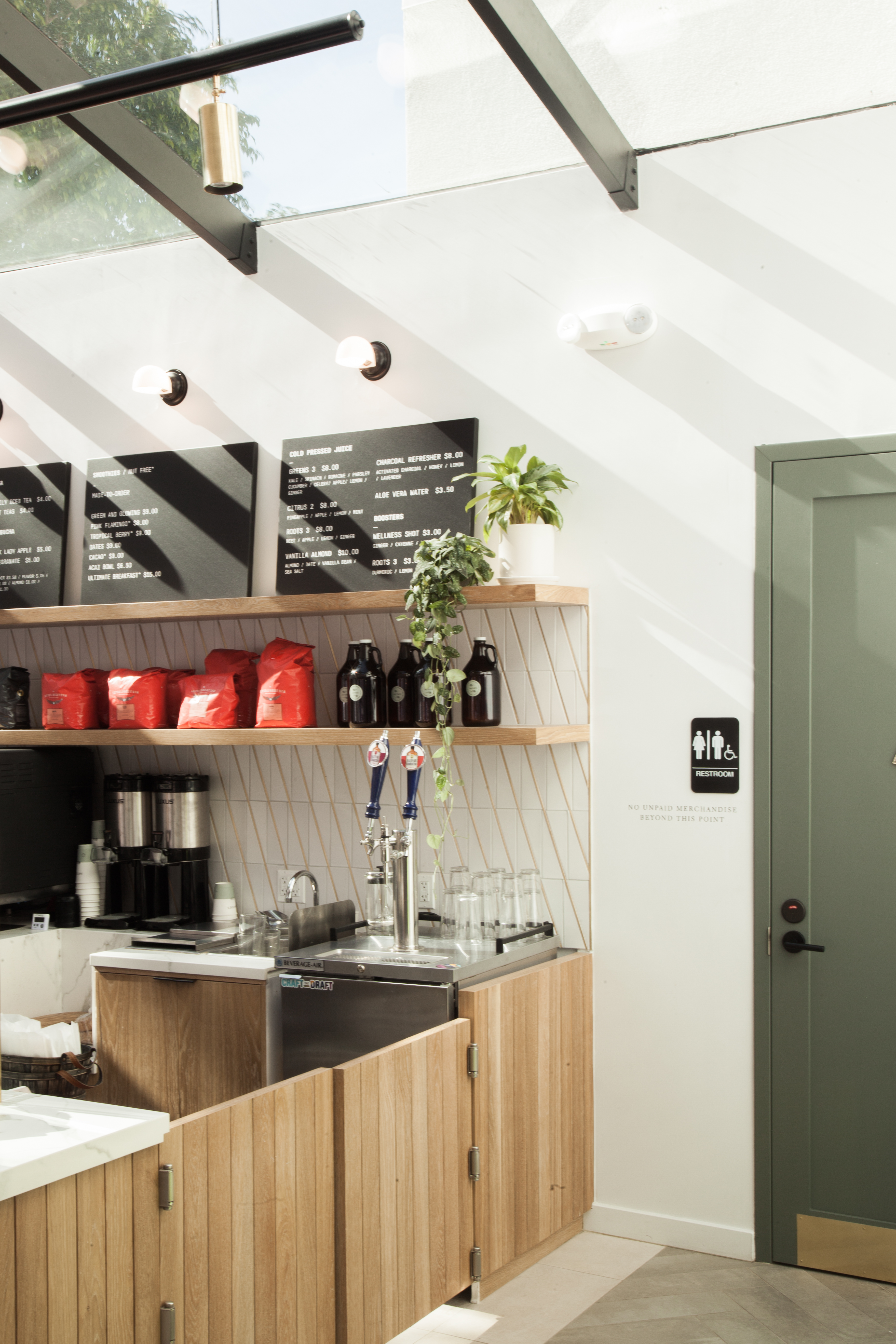
Our Scalene Triangles in Frost Matte outfit the backsplash at the cafe, what was your inspiration here? What made you choose this shape?
The architecture and interiors of the cafe, a nod to the greenhouse, is your first impression of Jayde's. Being a fairly small space, we wanted to make an impact while maintaining a calm aesthetic.

The Scalene Triangles offered a great opportunity to create visual movement; the matte finish provides a softness that pairs well with the elevated look of brass seen in moments throughout the cafe and market spaces.
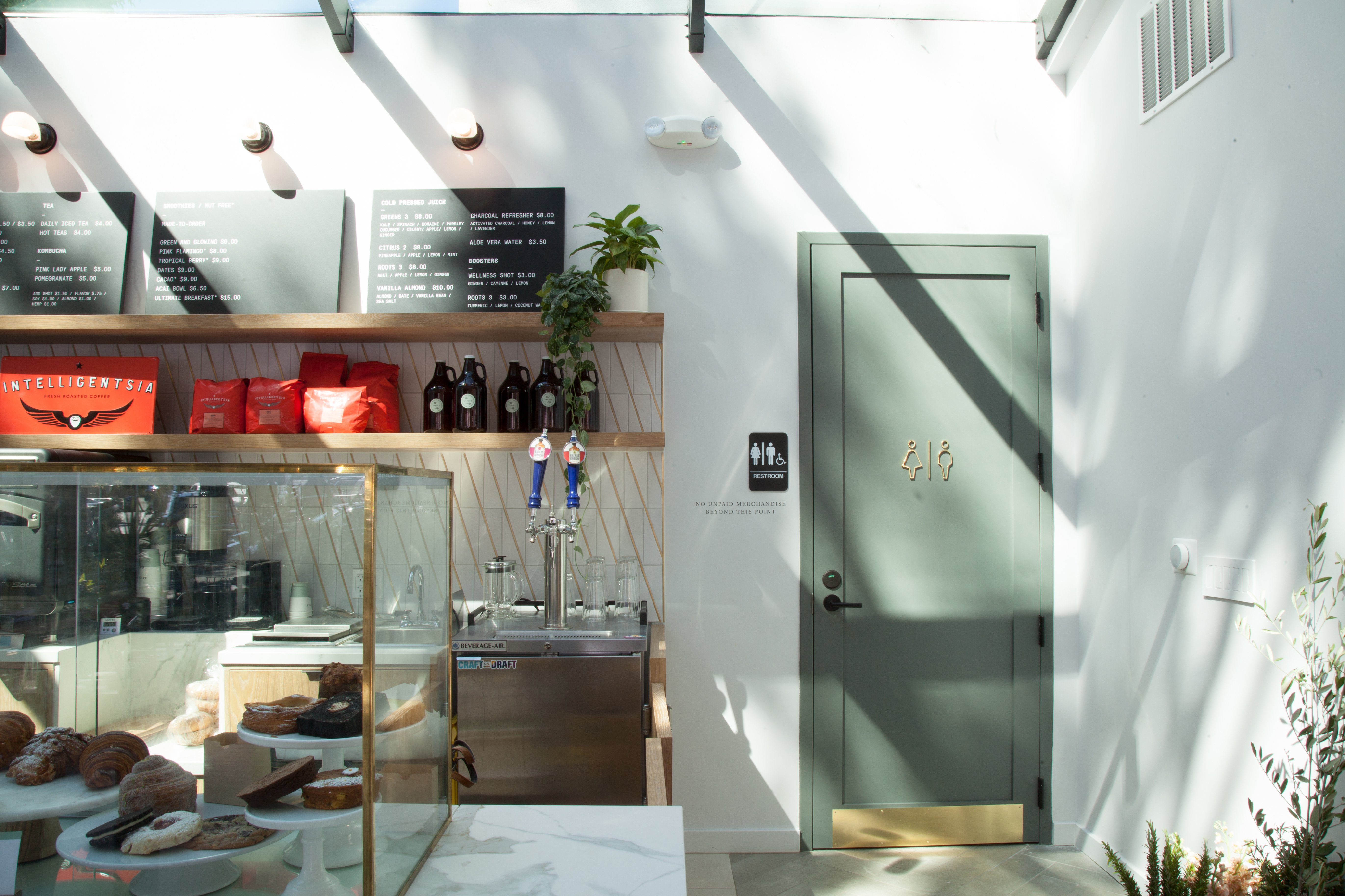
Tile Shown: Scalene Triangles in Frost Matte

The way you did brass inlay like grout is beautiful, how did you come up with this idea and how was it executed?
We believe the delicate touches are what give soul and personality to a space, and should not be overlooked. We took inspiration from brass inlay materials to emphasize the angle of the Scalene Triangle tiles as a way to lead the eye up to the product offerings, menu until finally, the massive skylight looking through the trees to the clear Beverly Glen skies.
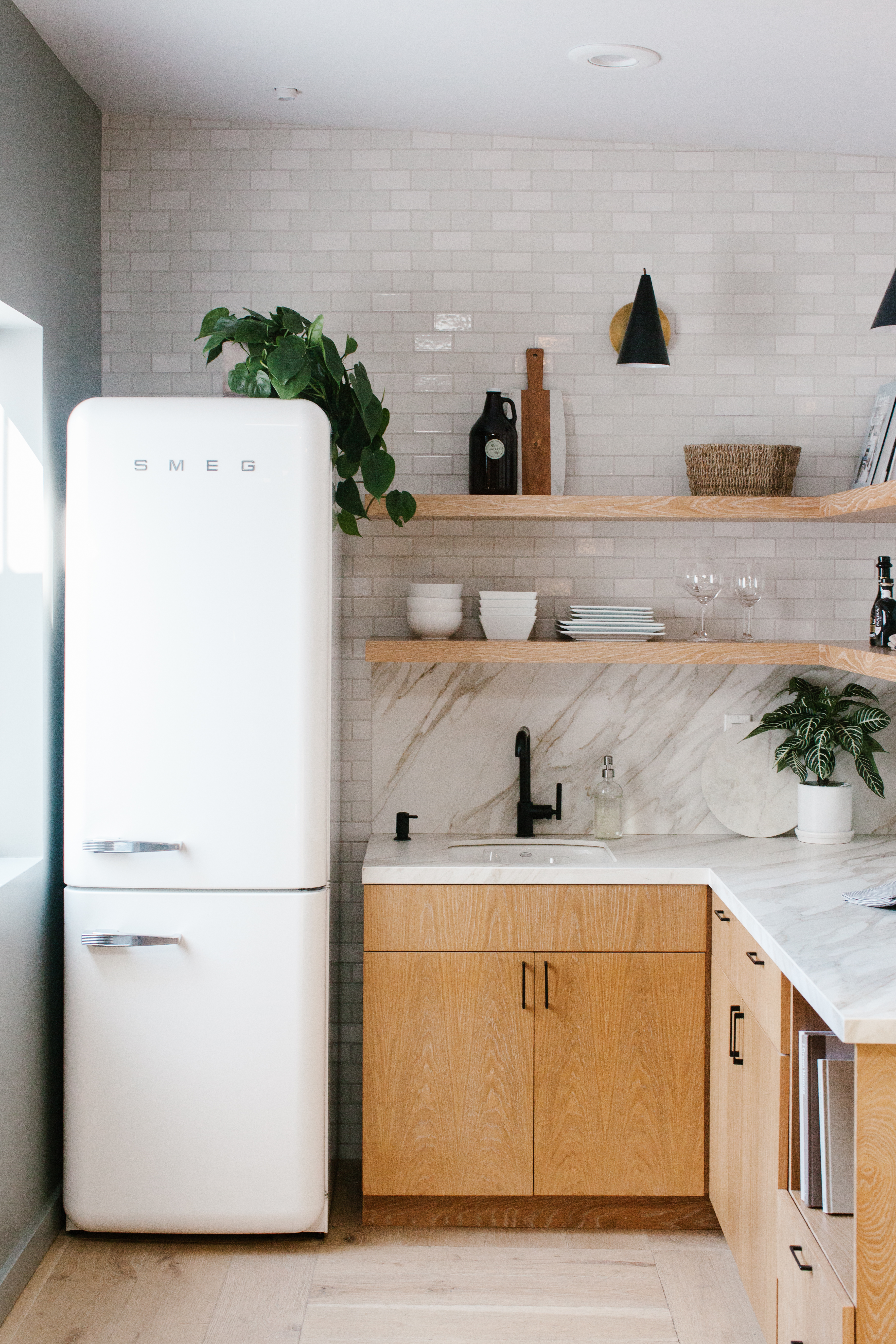
On to the kitchen, what made you choose the 2x4 size in Feldspar Gloss and Halite?
We wanted to bring attention to the beauty of the tile in a paired down office kitchen palette. Sprinkling gloss pieces in a mostly matte field provide depth and visual interest to a seemingly simple palette.

Tile Shown: 2x4s in Halite and Feldspar Gloss

And the bathroom with classic subway tile in French Linen?
Another nod to the classic tile pattern, we used the 3x6 subway shape and modernized it in a straight set application. French Linen in gloss paired well with Portola Paint's Nitty Gritty Green of the bathroom walls.
.jpg)
Tile Shown: 3x6 in French Linen

How was the installation process? Did you face any challenges? Lessons learned?
The brass inlay was a bit of a curve-ball for the tile installer, as it very slightly jogs the vertical grout lines as you progress along the pattern. Luckily, it is a very subtle element that adds the to movement of the tile shape.

Through the customization process for the green tile, we learned that green is the most challenging pigment to perfect in tile glaze. After multiple attempts of altering an existing Fireclay color we found the perfect combination was really the simplest solution, and merely switched the color of the tile body.


Lastly, what other shapes, colors or handpainted patterns would you love to use in future projects?
We are excited to continue to use Fireclay products on our upcoming projects and hope to have a project where we can specify the handpainted patterns. We particularly love the Harvest in White Motif!

Tile Shown: Harvest in White Motif
Inspired by this market? Order color samples online now. Working on a commercial project? Contact us!