


One of the coolest parts of the interior design world is its close-knit community. Scroll through any designer's Instagram feed and you'll see the love and support that other designers, often friends or former colleagues, have for one another as their careers evolve. This is one of those stories.
Velinda Hellen Design is the product of three alums of Emily Henderson Design, Velinda Hellen, Julie Rose, and Grace DeAsis. Julie Rose just took on the role of Lead Interior Designer at VHD, cutting her teeth with an exquisite bathroom featuring Fireclay Tile that she dubbed an "Autumnal Craftsman-Meets Contemporary Spa Bathroom."
We talked with Julie about her path to lead designer, her design process, and pulling off this incredible inaugural project running point at VHD.
Meet Julie!

First, can you tell me a little bit about yourself--do you remember when you first became interested in design? How did you get your start?
Design in general always felt like the path I was supposed to travel along for my career. At a young age, I was absolutely certain that I would become a fashion designer, so much so that my grandma would send me clippings of the newspaper fashion section and address it to Julie Rose Fashion Atelier. It wasn’t until I attended a summer intensive course for all areas of Design & Drawing at Parsons in New York that I felt like interior design was more my speed. I realized that summer that I had always gravitated towards architecture/interiors from a mix of being fortunate enough to travel at a young age & the classic sign of rearranging/decorating my bedroom often. A few years later, I decided to study Interior Architecture at Cornish College of the Arts in Seattle. I actually never thought I would go into the residential area of the interior world.

My dream was/is still to design restaurants & boutique hotels, you guessed it Kelly Wearstler is one of my design idols. Another one is my former boss, Emily Henderson. I would tell people while in school that one of the only reasons I would move back to my hometown of LA would be if I was one of her designers. In August of 2017, that’s exactly what happened & I got a crash course on residential design. I learned so much on the Mountain House & Portland Projects, helping to design & being the project manager of both out of town full renovations. That’s also where I met Velinda Hellen & Grace De Asis and now we are all fortunate enough to get to continue working together under the helm of Velinda Hellen Design.

Can you tell me about your design process? What phase do you enjoy most?
Designing for myself versus a client can be two very different processes. The first is a bit more sporadic & waiting for the big inspiration moments that help me to develop the overall design while the latter is more of a formula we use at VHD to so to speak speed date our client’s style. We start every project at VHD with a questionnaire that includes what styles they like, their wants & needs for the space, budget, etc. In addition to that, we like to have them pin some inspiration images & note what element(s) in the photo they are drawn to. That way we can really get a sense of the overall feel they are looking for & create a visual mood board presentation to make sure we are all on the same page before working on the design. Once we are clear on the vision then comes in the details with Floor Plan exploration. Going over the layout options with the client to show them what works within the parameters of the space versus what doesn’t due to code & clearances.

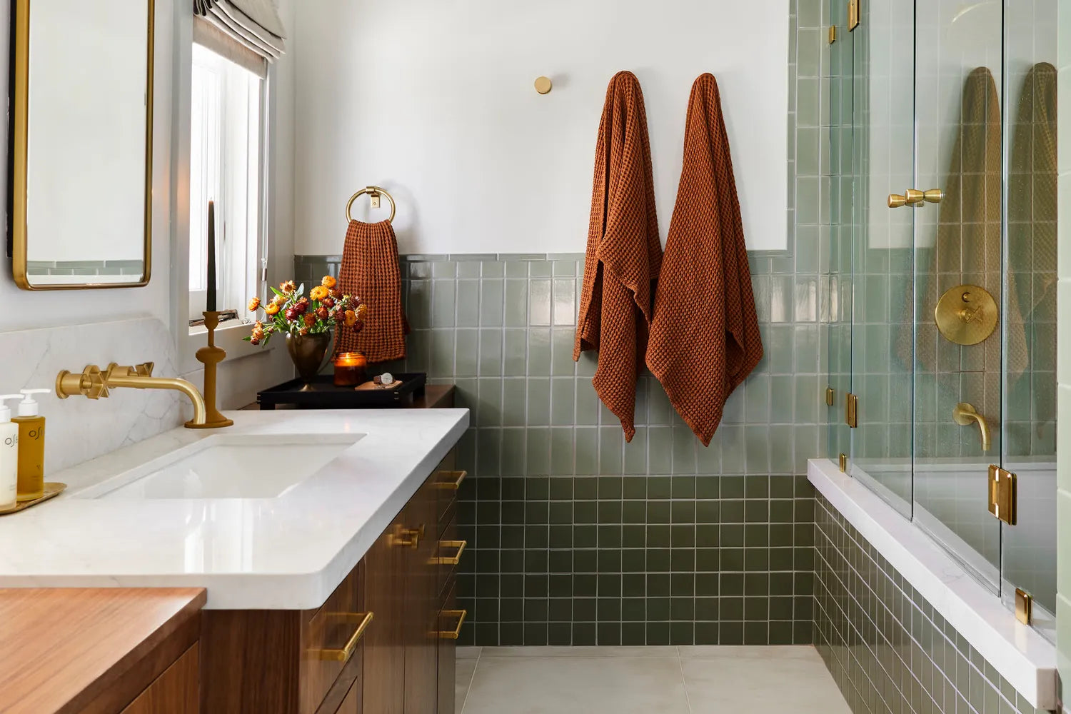
Tile Shown: Rosemary in 3 x 6 // Design: Velinda Hellen Design // Image: Sara Ligorria-Tramp
Then my favorite part takes place when we pull together the final design. Since most meetings are done virtually these days we really are only in the space for the initial walk-through & ‘final’ design presentation before construction begins. This is when we bring a flat lay with all their samples for the design to see how they look in the space since lighting plays a big role this is a crucial step. And finally, we present what the design will look like with full renders, these are always so important so the client can easily visualize what the end result will (fingers crossed) look like.

Tile Shown: Rosemary in 3 x 6 // Design: Velinda Hellen Design // Image: Sara Ligorria-Tramp
Now, let's talk about this client project! Is there a story behind it you'd like to share? Was this a remodel or renovation?
The renovation project was fairly simple when it came to the construction side of things, we weren’t moving any plumbing in the walls even the toilet stayed in place. The goal was to make each area more functional & of course beautiful than the previous design with lots of storage. The other vanity in the space felt overwhelming even painted white, one side overlapped the door frame to the bedroom & the layout of the storage wasn’t functional for our clients' needs. So instead we designed a custom vanity that felt more like a furniture piece with the two sides being more narrow to avoid any overlap & leaving a smaller footprint than the previous.

Tile Shown: Rosemary in 3 x 6 // Design: Velinda Hellen Design // Image: Sara Ligorria-Tramp
The left side includes a drawer with a collapsible ironing board & a large drawer for a laundry hamper below. The middle section has varying-sized drawers, some for make-up & others for a hairdryer, etc. On the far right, there is a long linear drawer for additional storage, a large deeper drawer below & an open shelf for extra towels. We swapped out the smaller vessel sink for a large 30” W trough style sink, this was a great alternative since the windows didn’t allow two sinks. To make the middle section feel more “purposeful” we designed a custom two tiered stone backsplash that sits perfectly between the windows & added a new wall mount faucet like the cherry on top! Next, was replacing the simple mirror with a rectangular brass framed mirror that you would never guess was also a medicine cabinet for even more storage.

How involved were the clients in the design process?
When it came to the design process Gloria, our client, let us ‘do our thing’ and was such a breeze to work with every step of the way. Throughout the construction phase we actually never went to the site. To save on budget and since this is an unprecedented time we live in nowadays we all decided she would be acting as our project manager. Between our GC whom we love and Gloria they did an amazing job communicating every detail with us via email and FaceTime. Velinda and I would constantly say that if she is ever looking for a new career move then she’s hired!

Before
What was your vision for the bathroom? What were your points of inspiration?
It got a makeover in the early 2000’s that made the room feel a bit out of place now. So, the hope was to restore this bathroom back to its original Craftsman-style charm that the rest of the house exudes with some modern touches to keep it feeling fresh and align with our client’s personal style. Walnut wood finishes, green tile colors that give a nod to the era of the home, the warmth of the brass tones & curved details that mimic the client’s banister were our jumping-off points for the design.
After

Tile Shown: Rosemary in 3 x 6, Peabody in 3 x 3 // Design: Velinda Hellen Design // Image: Sara Ligorria-Tramp
What made you choose these two shades of green? Were there any other contenders?
The client has a beautiful dark green tile fireplace surround on the first floor that is original to the home. We wanted to carry that look up into the main bath but with more contemporary colors and an overall lighter look. We used the Peabody color for the bottom portion which was so similar to the tile downstairs with its slight yellow undertone. By mixing it with the Rosemary color on the top & in the shower surround it created a more spa-like atmosphere since this is the primary color in the space.

Tile Shown: Rosemary in 3 x 6, Peabody in 3 x 3 // Design: Velinda Hellen Design // Image: Sara Ligorria-Tramp
How did you land on the pattern?
Color blocking the two tones of green was a way to help balance out the custom walnut vanity that spans the length of the room. The Peabody in the smaller 3x3 tiles helped to anchor the vanity and in a way camouflage how big it is in the space. The tub height was a natural stopping point for the Peabody and we didn’t want the color to match the height of the vanity exactly, instead, we created some overlap with the Rosemary in the 3x 6. This helps your eye to bounce all around and surprisingly this trick keeps the space feeling more balanced. I love to mix up both color and size tiles when possible. The two different sizes helped the space to feel modern and classic at the same time without using the ever-popular running bond pattern. But if we had used the 3x 6 for the Peabody as well another option would be to rotate it 90 and run it stacked horizontal or keep it vertical for a more modern feel. Endless options!

Tile Shown: Rosemary in 3 x 6, Peabody in 3 x 3 // Design: Velinda Hellen Design // Image: Sara Ligorria-Tramp
Had you worked with our tile on any previous projects? Any tips learned from working with handmade tile that you'd like to share?
Velinda recently used the Star and Cross pattern in two colors for a kitchen backsplash, whenever we use Fireclay our clients are always so impressed with not only the product but also the customer service. We love a company that shows they truly care about both. As a designer, there are four things to consider when working with handmade tile:
1. Make sure you emphasize to your client that there will be some irregularities with the shapes/colors of the tiles so it never comes as a surprise when they arrive on site.
2. Many tile installers are used to very straight edge tiles so always ask if they have experience installing handmade tiles before you hire them.
3. Mix, mix, mix up those tiles from different boxes you never want your installer only taking from one box at a time. Each batch will slightly vary in color so to create a more cohesive look mix them all up. This will avoid an accidental tonal color blocking situation.
4. For a more ‘texture’ look match your grout color tone as close as possible to the color of the tile. To have the eye focus on the pattern the more contrast between tile and grout the bolder the pattern will appear.

Tile Shown: Mini Star in Ivory and Mini Cross in Calcite Design: Velinda Hellen Design // Image: Sara Ligorria-Tramp
Why do you love tile? What makes you choose it for surfaces over another material?
Tile is just so versaTILE. Get it? ;) You can use a simple 3” x 6” white tile and take it from classic to modern just depending on the pattern that’s installed. A running bond will be a timeless classic look while stacking it vertically gives it a fresh and modern feel. Add in a color or two, mix and match shapes & sizes, the design possibilities are endless! Plus it’s very functional and durable which is a top priority for all clients. Tile is always my first choice for any vertical surface that needs to be easy to clean or in a wet area.

Tile Shown: Small Diamonds in Escher Pattern
Lastly, any tiles you would love to use in any future projects?
I’ve been eyeing the Escher pattern for a potential client’s bathroom. We designed their kitchen to have a mod 60’s feel and pulling in some of the colors from their kitchen into this pattern would tie everything together since you can see the spaces from one another. Another I am currently designing for a client hoping they will be open to using is a custom mosaic. The fact that you can really customize with Fireclay is a big part of why so many designers source from them over and over.
Ready to take the lead in your own home renovation? We're here to help! Reach out to our Design Consultants for free 1-on-1 assistance including design help, sample selection, estimating, and ordering.
