


From the moment you cross the threshold of designer Claire Thomas’s Los Angeles home, you know it’s a special place. A master storyteller, Claire leaned into her background throughout the design journey—she had a clear vision, and every selection helped paint the full picture. Bold tile choices draw inspiration from the historical roots of the 1929 Spanish Colonial, with showstopping Art Deco moments throughout (including a fireplace that doubles as a karaoke stage).
We chatted with Claire about the history and inspiration of the home, her tile choices in each space, and her experience designing custom mosaics—a first for this longtime Fireclay collaborator!

Image courtesy of Claire Thomas
Hi Claire! First, could you share a bit about yourself and your design journey for those who are unfamiliar with your work?
I’ve been a writer and Director for 15 years and stepped into interior design at first with my own projects, and now that has expanded into something much bigger. Because my point of view comes from a storytelling place, I view spaces as an opportunity to express character and personality. When I work with clients, the space is always meant to be a pure expression of who they are in the world rather than something driven by trends or social media. At the end of the day, a home should feel like it is yours, whether you are standing in the space or not. It should have an undeniable signature that anyone who knows you could walk into the space and go, “oh yes, this is my friend‘s room.” I think there’s something beautiful about that. And it’s very easy to lose that sense of self when there’s so much pressure to have a social media-ready aesthetic.
![]()
Tile: 1x1 Amber | Design + Image: Claire Thomas
I am a huge nerd, which anyone who knows me will absolutely confirm, and unsurprisingly, history is one of my favorite rabbit holes to dive down. I’m a Los Angeles native and I care deeply about my city's history, especially its aesthetic continuity. Los Angeles is one of the only places in the world where you can have Spanish Colonial next to Tudor next to mid-century next to craftsman, and it makes sense. This is because from the 1920s to the 1950s there was an explosion of artisanship, and craft homes were built intentionally with a specific point of view. The idea of destroying that point of view feels a bit like ripping the pages out of a book or painting over a work of art to me. So something I’ve become known for is taking historical properties that have had the character stripped from them and then returning it. This is one of my favorite things to do. It’s not about creating a space that is museum perfect, but rather making sure the aesthetic is in line with the original intent and story of the space and how the new owners get to carry that story forward. I think it’s really beautiful to approach homes with a sense of stewardship rather than conquest. I’ve always felt fortunate to get to pour love and memory into the home I have lived in.
So I suppose this is a long-winded way of saying if you’re buying a historical home, for God's sake, please don’t destroy it just because you saw something cool on Pinterest.
![]()
Tile: 3x3 Ivory Gloss, 1x1 Ivory Gloss + Graphite | Design + Image: Claire Thomas
This house is such a unique find! Can you tell us about the history of the home and your vision for the design?
The home was built by an architect in 1929. It is an AIA case study home, which means this house was used as a reference by the architect for other clients so they could see his work on display. There’s so much original character that has been preserved over the years and my main focus with this home was to celebrate that as much as possible, and then restore any character that had been stripped over the decades.
For every design project, I have a storyline because I think that makes it so much easier to make choices and decisions. For the most part, there’s no such thing as a bad object or a good object. It’s more, does this object fit the story we’re telling? So the story for this house is the Brontë sisters go on vacation in Spain. I wanted to fully lean into the Gothic romance of the house, but give it a little bit of a suntan and some Hollywood glamour and levity. There’s definitely a bit of Norma Desmond running through the house automatically as well.

Tile: Star & Cross Antique and Burnt Umber | Design + Image: Claire Thomas
Let’s talk about the kitchen. We love the custom mosaic borders on the floor and backsplash. What was the inspiration behind this space, and how did you land on the custom patterns?
I had a very specific inspiration for the kitchen, which was the kitchen at the Ennis house. The Ennis house is a Frank Lloyd Wright Mayan home in Los Feliz, and one of my favorite historical homes in Los Angeles. It’s most well-known for the iconic bricks it is built out of, but I think the kitchen is just beautiful. One of my favorite aspects of Los Angeles architecture from the 20s through the 50s is that it did not matter if your house was Mayan, Spanish, streamline, Tudor, or Ranch—you were getting an Art Deco kitchen and bathroom.
![]()
Tile: 3x3 Ivory Gloss, 1x1 Ivory Gloss + Graphite | Design + Image: Claire Thomas
I very rarely do white in kitchens, so for me this is actually very neutral, but there is something so warm and inviting about Fireclay’s Ivory. It’s a very lush, rich version of white. The way that you can tell the difference between a mediocre vanilla ice cream and a really decadent custardy French ice cream. I created a 1x1 mosaic pattern using Graphite, which has the most beautiful glaze in detail to it. It shimmers in the light and is so unique. Creating the pattern on the ceiling line as well as the floor really makes it feel like an Art Deco space. They loved tile back then and every surface would be clad in it if they had the opportunity to do so.
![]()
Tile: 3x3 Ivory Gloss, 1x1 Ivory Gloss + Graphite | Design + Image: Claire Thomas
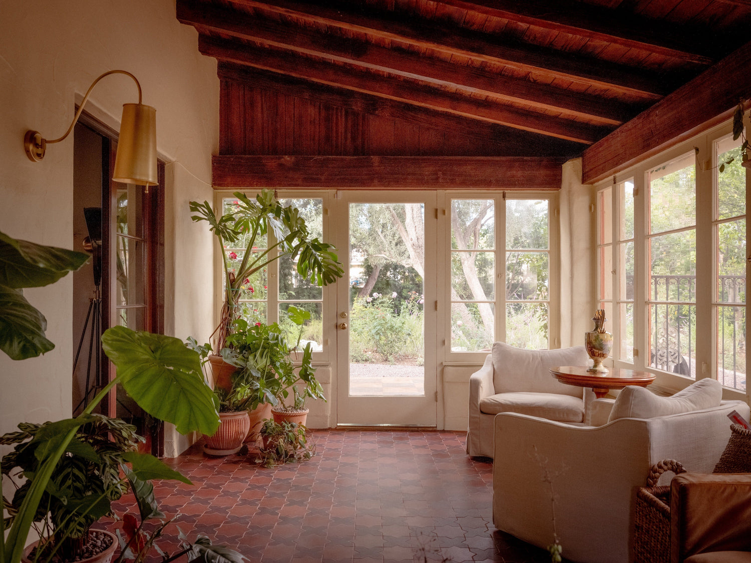
In the sunroom and entryway, you chose our Star & Cross in Antique and Burnt Umber ceramic stains. What was the thought process behind this color pairing? How does it play into the home’s historic feel?
Both the sunroom and the entryway had this very sad 90s porcelain faux terra-cotta tile that was not original to the home. I knew I wanted to put something that had the richness in texture of 100 years of patina. When I saw the samples of these two colorways in person, I just knew I wanted to combine them. By having two tones, it immediately gives it a custom look, and because both tones have high variation, it absolutely looks like something that has been there for 100 years.

Tile: Star & Cross Antique and Burnt Umber | Design + Image: Claire Thomas
The primary bathroom is a showstopper! Can you tell us your main influences behind the tile design? What were you hoping to evoke with the mosaic motif?
I love the RKO musicals of the 1930s, so imagine Fred and Ginger films like Top Hat and The Gay Divorcee. In all of these films, they have these fabulous black-and-white sets with neoclassical elements. When I saw that the bathroom had been clad and marble in the 90s, I knew it was an opportunity to restore it to an Art Deco vision.
![]()
Tile: 3x3 Limewash Gloss, 1x1 Limewash Gloss, Sweet Pea Gloss & Mackerel | Design + Image: Claire Thomas
The first thing I knew it needed was a classic Art Deco bath alcove. There’s something so cozy about being nestled in an alcove and I love a Roman tub, so this just seemed like a natural evolution. The Greek Key pattern is so timeless, I feel like it looks like it could’ve been installed when the house was originally built. I love working with Fireclay’s high variation glazes, and Mackerel, which is the dark tone in the pattern, was the perfect choice. It has black, deep blue, deep green, and even flecks of gold in it, which give the tile the shimmering effect of a fish scale. I also added just a teaspoon of Sweet Pea to break up the white and to add a third color to the combination, echoing it with the little vanity stool.
![]()
Tile: 3x3 Limewash Gloss, 1x1 Limewash Gloss, Sweet Pea Gloss & Mackerel | Design + Image: Claire Thomas
Another incredible mosaic moment is the speakeasy. What’s the story behind this space, and what drew you to our Amber Studio Glaze for it?
The speakeasy is probably the biggest transformation in the entire house. Previously, it was a concrete box. I wanted it to be like a shimmering sequin gown a cabaret singer would wear, and I knew the way to get that effect was with a 1x1 tile in a high variation gloss. Amber is this beautiful, rich gold tone with elements of cognac swimming in it. I am a bit campy, and I found these flickering candlelight bulbs that feel a little like Pirates of the Caribbean, but in a good way. The flickering bulbs against the tile create this wonderful shimmer that completely transports you once you enter the room.
![]()
Tile: 1x1 Amber | Design + Image: Claire Thomas
We love the pattern on the fireplace in the basement. How did you land on this particular application? What role does it play in the room’s energy?
I wanted to do an Art Deco pattern through mosaic, and was inspired by the pattern of the floor at Grand Central Station. For the colors, there wasn’t a tone that perfectly matched the cherry red of the drapery in the room, so instead I chose a color palette that creates that tone as if deconstructed. So, Mauve, Tiger’s Eye, and Amber all mixed together on a paintbrush would create the perfect cherry tone.

Tile: 2x2 Mauve Gloss, Tiger's Eye + Amber | Design + Image: Claire Thomas
The screening room is probably the room I spend the most time in. It’s sort of where I go to escape and work. It’s incredibly quiet and there are no windows or clocks so time has no meaning there. The leopard print carpet is an homage to my mom, who was extremely cool in the 90s and had leopard print carpet in my childhood home. It’s also a bit of a nod to Norma Desmond. I wanted the space to feel very glamorous and a bit maximalist, so color drenching it in a deep scarlet with the leopard and with the art deco fireplace created a very luscious combination.

Tile: 2x2 Mauve Gloss, Tiger's Eye + Amber | Design + Image: Claire Thomas
This project involved several gorgeous custom mosaic elements. How was your experience working with the Fireclay team to bring the custom mosaics to life? Did you use renderings?
This was so exciting for me, because I’ve worked with Fireclay since my very first design project eight years ago, but this was my first time doing custom mosaic with them. I am notoriously bad at math, so having the design team work out every single detail of the installations was a dream. I had renderings made by them and a helpful step-by-step guide I could hand to the contractor that answered every question that could come up. It made the entire process go so much smoother, and especially with such complex patterns it made it pretty much foolproof.
![]()
Tile: 3x3 Limewash Gloss, 1x1 Limewash Gloss, Sweet Pea Gloss & Mackerel | Design + Image: Claire Thomas
You’ve used tile on the floors of several distinct spaces throughout your home, from the sunroom to the speakeasy. What do you love about ceramic underfoot?
I love the look of ceramic floors so much because I think they add a wonderful texture and layer of detail to a room. There’s also utility to it where it’s very strong, easy to clean, and durable against children and dogs, of which I have multiple.

Tile: Star & Cross Antique and Burnt Umber | Design + Image: Claire Thomas
As a frequent Fireclay collaborator, you’ve worked with many of our product lines. What keeps you coming back to handcrafted materials for your projects?
Fireclay is one of my favorite brands to work with because they value so many of the same things that I do: craft, history, functionality, and beauty. It’s very difficult to find products that embody all of these attributes, but Fireclay is one of them.
![]()
Tile: 3x3 Ivory Gloss, 1x1 Ivory Gloss + Graphite | Design + Image: Claire Thomas
Love Claire's style? See more of her work with Fireclay here. And if you're ready to take the first step in your own project, book a free consultation with us to get started.
