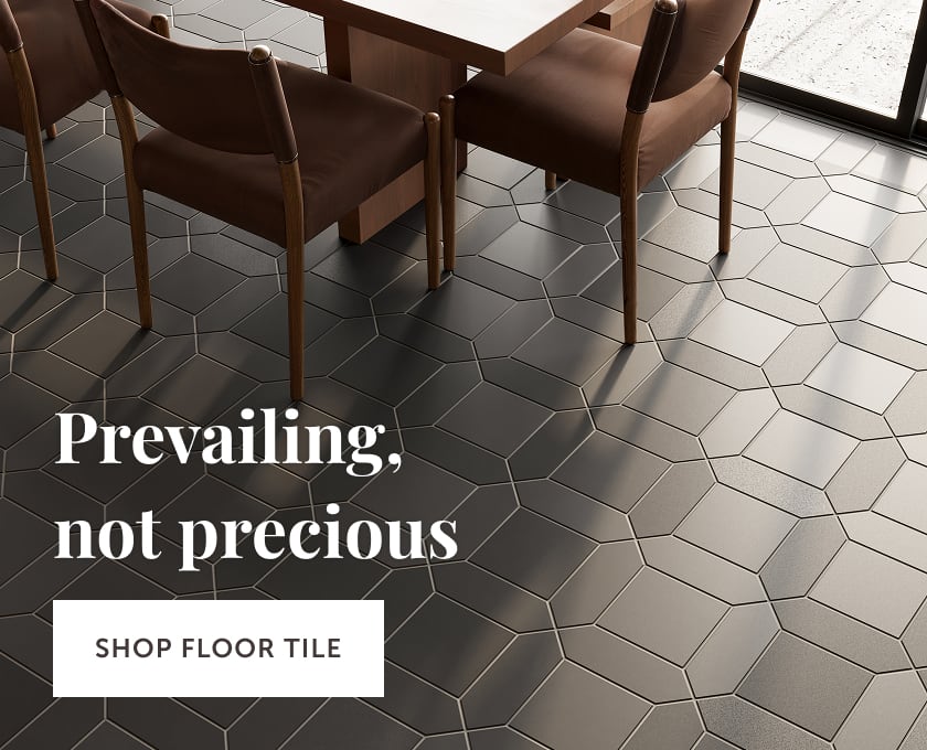


Hotel Julie isn’t your average hotel. First, each room was meticulously designed to immerse you into a Shakespearean world of color, texture, and the hotel’s signature black and white checkered tile pattern. Second, it has its own TV show.
We sat down with designers and visionaries Autumn Hachey and Jillian Smith-Moher, who teamed together to create this full-service experience, to chat about the history behind the original 1800s building and their passion for storytelling through design. Keep reading for the full interview!
Meet Autumn + Jillian!

Image: Ryan George
Let's talk about Hotel Julie. What's the story behind the space?
Autumn: Hotel Julie is a full-scope Stay Here project where we offered our turn-key branding and interior design service to our clients and property developers Jake and Paula. Myself, alongside an extended team of incredibly talented collaborators, completely redesigned the hotel from the inside out. We offered our clients a package that included everything from developing the overarching project narrative and strategy, to their brand identity, website, photography and interior design.

Tile: 12x12 Raven Matte + Frost Matte | Design: Autumn Hachey, Jillian Smith-Moher | Image: Lauren Miller Photography | Installer: Hotel Julie
On the branding side we worked with Abigail Ballanger on our brand strategy and Danielle Barich on our sensory strategy, and on the interior design side myself and Sarah Brinksman from the Stay Here team collaborated with Jillian Smith-Moher from Twenty-Two Twelve. (We actually had our last collaboration featured here on Fireclay Tile- when we redesigned the Lake Placid Lodge in Whistler!)
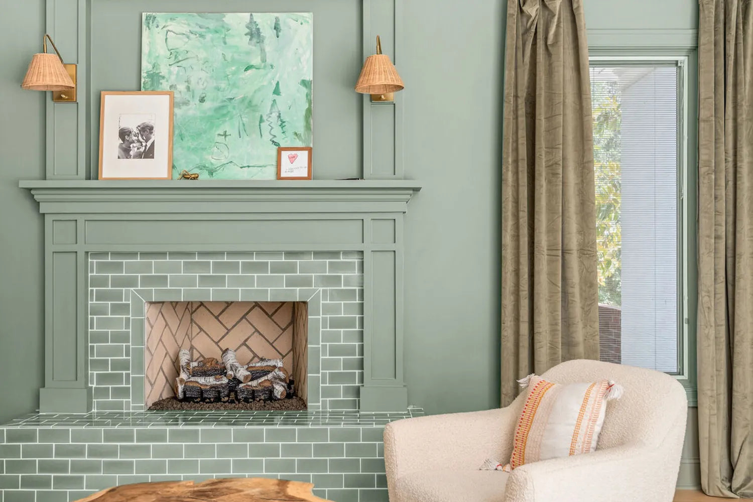
We start all of our Stay Here projects off with a comprehensive strategy where we dig into the story of a space. The property is a gorgeous 19th-century rowhouse in Stratford, Ontario that was beautiful from the outside but was in need of some updates on the inside. The town is known for its famous theatre festival which we incorporated into the design. Throughout the hotel you’ll find subtle ways that we’ve integrated the overarching theme in the space in the form of soaring velvet valances and drapery inspired by theatre curtains to frilly light fixtures that resemble a Shakespearean collar to the mural painted on the outside of the building that features Nightshade flowers creeping through the burning velvet drapes (the poisonous flower in Romeo and Juliet). The logo for the hotel is a hand-sketched burning heart that ties back to Shakespearean tragedies of the heart.
Inspired by avant-garde theatre and Shakespeare, we named the property Hotel Julie—our modern twist on Romeo and Juliet. The entire process of redesigning this hotel was documented and turned into a ten-episode TV show that is currently airing on CTV Life.

Design: Autumn Hachey, Jillian Smith-Moher | Image: Lauren Miller Photography | Installer: Hotel Julie
How did you get involved in the project?
Autumn: Jake and Paula reached out to Stay Here directly through the form on our website, telling us about the project. I was absolutely thrilled because it’s always been a dream of mine to design a hotel. Once we officially signed the project I pulled together an incredible team to make the vision a reality. On the TV show front, after the project was officially greenlit, I pitched the show concept directly to Bell Media and they loved it and greenlit the first season!

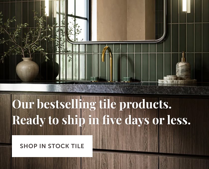
Tile: 6x6 Raven Matte + Frost Matte | Design: Autumn Hachey, Jillian Smith-Moher | Image: Lauren Miller Photography | Installer: Hotel Julie
You've designed many homes, but is this your first hotel?
Jillian: Twenty-Two Twelve is a full-service interior design firm based in Toronto founded by myself and my sister Haley McDonough. While our focus is residential, we collaborated with Stay Here on two other short-term rental projects. We were excited when Autumn reached out about collaborating with her on this project as it would be our first ever hotel! We enjoy collaborating with Stay Here as designing a hotel vs. designing residential allows for much bolder decisions and for us to really run with creative ideas.

Tile: 12x12 Raven Matte + Frost Matte | Design: Autumn Hachey, Jillian Smith-Moher | Image: Lauren Miller Photography | Installer: Hotel Julie
Did you approach the design of a hotel differently than you would with a home?
Jillian: There are big differences between designing residential houses and hotel properties, the obvious difference is the ability to have a louder overall aesthetic but there are also key differences in function as you consider the end user. In a residential space you know that there is one end user and that they will have the ability to get to know their home so we like to make everything as discreet as possible and utilize smart home systems. In a hotel where guests might be coming for as short of a period as 2 nights, this approach would be utterly confusing! Everything has to be completely intuitive. For example, in the kitchens at Hotel Julie you will note that we used open shelving so that everything is on display and guests don’t have to waste any time searching!

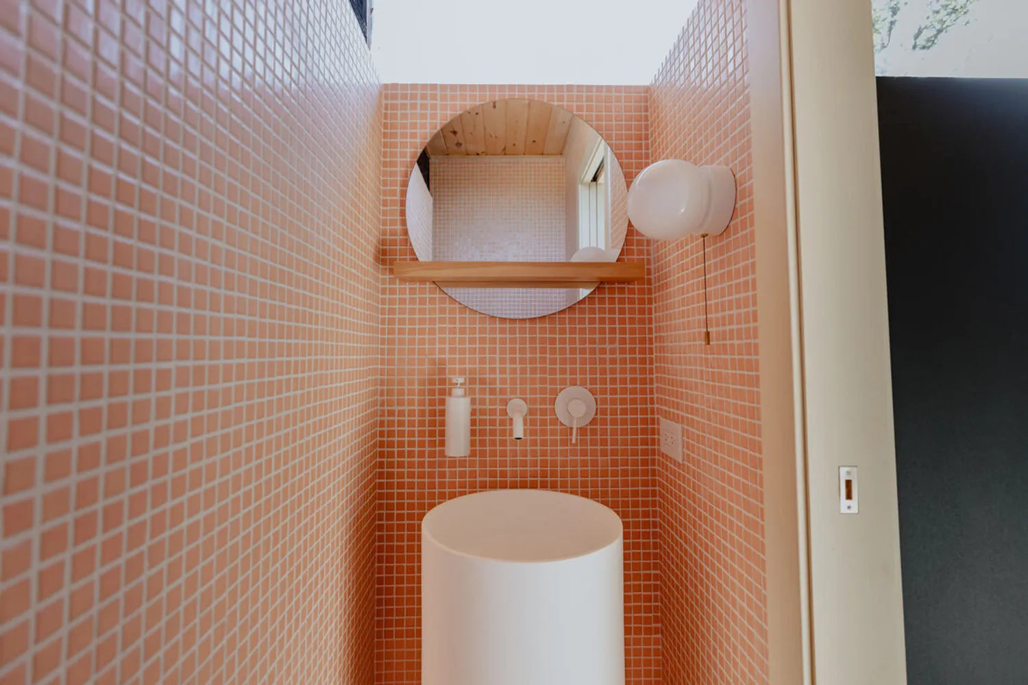
Tile: 6x6 Raven Matte + Frost Matte | Design: Autumn Hachey, Jillian Smith-Moher | Image: Lauren Miller Photography | Installer: Hotel Julie
Autumn: Funnily for me, I’ve actually ONLY ever designed vacation rentals. The first client design project I ever worked on was a vacation rental called The Summer House, and that project was what inspired me to start my company Stay Here. I saw there was a gap in the market for short-term rental owners who were looking for a turn-key solution to launch their properties that encompassed everything a vacation rental would need in order to open (e.g. branding, logos, social media, interior design, a curated guest experience).
When people are booking a short-term stay the interior design plays such an integral role and people are seeking places that don’t look like home. I think in comparison to residential design, vacation rentals require unique, interesting and boundary-pushing ideas. I love designing spaces that are playful and weird—which perhaps might not always be as palatable in a residential setting.

Design: Autumn Hachey, Jillian Smith-Moher | Image: Lauren Miller Photography | Installer: Hotel Julie
The hotel was built in the 1800s, what notes did you take from its history for your design?
Jillian: While the house was built in the 1800’s, it had been renovated many times in order to add in modern comforts. Along the way the space lost quite a bit of the original character inside. Our goal was to add in finishes that felt like they could have been there all along like applied moldings, natural stone, unlacquered brass and of course classic black and white hand-formed ceramic tiles in a checkerboard pattern from Fireclay Tile.

Tile: 6x6 Raven Matte + Frost Matte | Design: Autumn Hachey, Jillian Smith-Moher | Image: Lauren Miller Photography | Installer: Hotel Julie
What areas needed updating?
Jillian: The hotel had not been touched in about 30 years and was feeling quite tired. Almost everything needed updating. All new floors, and full gut renovations of every single kitchen and bathroom. This gave us a chance to do a bit of reconfiguring and correct some awkward layouts.

Tile: 6x6 Raven Matte + Frost Matte | Design: Autumn Hachey, Jillian Smith-Moher | Image: Lauren Miller Photography | Installer: Hotel Julie
What aesthetic were you going for?
Autumn: Our overarching brand strategy really led the way for our design to take shape. It’s so important to get familiar with the town and building you’re designing—and in the case of short-term rentals, it’s important to have a grasp on who your ideal dream guest would be. After researching the town and the area it was very clear that theatre and the arts were very important and that the property would be where many people would stay during the festival season so it needed to inspire those guests. We used that information as inspiration to create avant-garde, theatre-inspired design. The aesthetic of Hotel Julie is a harmonious combination of timeless vintage and playful modern design.

Design: Autumn Hachey, Jillian Smith-Moher | Image: Lauren Miller Photography | Installer: Hotel Julie
Hotel Julie has the most beautiful, elevated color palette—where did you draw inspiration from?
Jillian: We loved that we had an opportunity to create nine distinct colour palettes, one for each suite! We focused on heritage colors to honor the history of the space and just loved the balance of their richness with dusty undertones. We wanted the hotel to be moody, playful and sophisticated with a common language throughout.

Tile: 6x6 Raven Matte + Frost Matte | Design: Autumn Hachey, Jillian Smith-Moher | Image: Lauren Miller Photography | Installer: Hotel Julie
You layer color, texture and pattern throughout the hotel, how do you keep your vision cohesive?
Autumn: When we set out to design the hotel it was very important to us that all nine flats felt uniquely different- but it was equally important to us that they felt connected. In order to create cohesion we repeated colour palettes, materials, themes and motifs throughout the flats in a variety of applications.
For example- we established two custom headboard designs- wiggle headboards and oversized pill-shaped headboards. These headboards can be seen throughout all of the Hotel Julie flats. However, by selecting different velvet swatches for each and changing up the other elements in the rooms, these headboards feel unique in each space but are connected throughout the hotel.

Design: Autumn Hachey, Jillian Smith-Moher | Image: Lauren Miller Photography | Installer: Hotel Julie
We also achieved this through the use of a few key materials like travertine, nero marquina marble, arabescato marble, rosso levanto, burl wood, fluting, velvet, floral patterns, and checkerboard motifs.
What made you choose the black and white checkerboard pattern throughout the flats?
Jillian: Black and white checkerboard is classic and synonymous with British design. As the town of Stratford was based on Shakespeare's hometown of Stratford-upon-Avon it felt like the perfect selection for the hotel.

Tile: 6x6 Raven Matte + Frost Matte | Design: Autumn Hachey, Jillian Smith-Moher | Image: Lauren Miller Photography | Installer: Hotel Julie
Which of the nine flats is your favorite and why?
Autumn: For me I have two favourites!
My first favourite is flat 5. For me, flat 5 holds a very special place in my heart because the sofa in flat five is a vintage sofa that I impulsively purchased before I had officially signed on to the project. (It’s a part of a 5 piece set from the 1960s, made in Chicago).
The clients had reached out and I had sent my pitch and was anxiously awaiting to hear back the sofa set became available for purchase on Facebook marketplace. I knew the set was PERFECT for the project and I jumped at the opportunity to purchase it knowing it would be the jumping-off piece of furniture for the hotel. We ended up signing on the project and the rest is history. The sofa in flat 5 was the first piece of furniture we sourced for the project. We reupholstered it in a gorgeous floral velvet from House of Hackney that I HAD to have. It was actually out of stock for an excruciatingly long time and I was adamant about pushing the deadline to the very last minute to have this specific fabric.

Design: Autumn Hachey, Jillian Smith-Moher | Image: Lauren Miller Photography | Installer: Hotel Julie
Flat five has a few other key features that I absolutely love: it’s the only flat with its own “mudroom”. Upon walking into the suite you’re transported into this dreamy space with wall-to-wall checkerboard carpet, a giant floral ottoman (foreshadowing the sofa in the next room)..soaring custom burl closets, a nero marquina portal doorway leading to a calacatta viola sink and…. One of my design dreams come true, a heart-shaped bathtub.
My second favourite flat is flat 4. I absolutely love the scheme in flat four- the neutral green walls and sofa contrasted with the pop of rosso levanto red. I love the arabescato and travertine check floor, the arabescato arched backsplash, the vintage verde luana bistro dining table. This flat also features one of my favourite design elements- a gigantic keyhole door opening flanked with theater green velvet theater curtains that acts as the door.

Design: Autumn Hachey, Jillian Smith-Moher | Image: Lauren Miller Photography | Installer: Hotel Julie
Jillian: While every flat has special moments that I love, I would say flat three resonates the most with me. The pallet was completely unexpected and moody. I love how the chocolaty brown walls in the heart of the space town down the purple hues in the rest. The black and white checkered tile in the bathroom perfectly grounded the purple walls and added a layer of sophistication. It was all about balance in this divinely feminine flat.

Design: Autumn Hachey, Jillian Smith-Moher | Image: Lauren Miller Photography | Installer: Hotel Julie
Inspired by Hotel Julie's avant-garde aesthetic? Bring home up to five free color samples to create your own signature checkered floor or wall.