


All Images: Aubrie Pick
Designers Andrea Faucett and Lynn K. Leonidas teamed up on this San Francisco remodel, where its family was truly at the heart of their design. Once the childhood home of their client, this personal project pulled inspiration from everything from building facades to their client's art and Fiesta Ware collections. We talked with Andrea and Lynn about this home and the story behind it below:
How did you two team up on this project?
LKL: Andrea and I used to work at the same firm and while our styles are different, they mesh really well together. This was my first client on my own and I was still transitioning into running my own company, so I contacted Andrea to team up.
Tell us about the house, was it a full remodel? Renovation?
LKL: It was a full home remodel with furnishings. The house is in the Richmond district in San Francisco and originally had a Victorian layout with a long hallway. We worked with
Kwan Design Architects on the new layout (which is an open floor plan) to open up up the rooms on the first floor, so that they flow into each other.

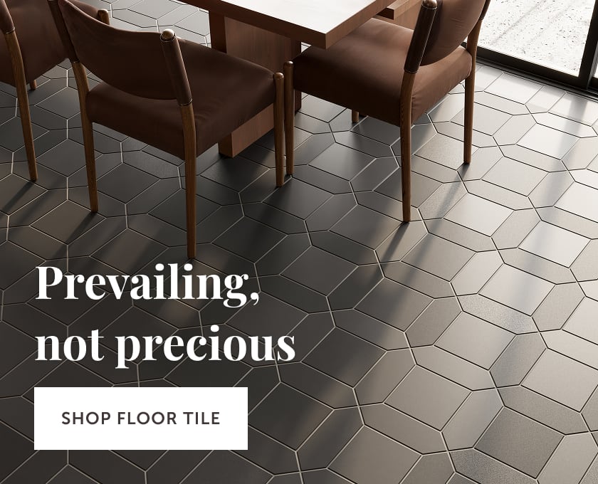
Tile Shown: 6" Hexagons in Daffodil
AF: The layout was very barebones and they needed help with the layout so that the space better suited their needs. The kitchen was a whole overhaul; there were no windows or light well, so we needed to focus on lighting and bringing in more warmth.


Note: The blackened steel stove hood was fabricated by Chambers Art & Design
How involved were the clients in the process?
LKL: The husband actually grew up in this house, so it was definitely a personal project; he knew the strengths and the weaknesses of the space and what he wanted to improve. All the finishes were chosen to represent their personal tastes and lifestyle. The husband and their two young sons are surfers, so they like the inside/outside look. The artwork they collect is bright, with an emphasis on shape and color—so they wanted color and geometry reflected in their materials.

What look were you going for in the kitchen?
AF: The kitchen and the fireplace needed to be in harmony together. The walnut wood and the triangle shape are both very retro feeling, so I think that is what we were going for. Also, all of the finishes were used to be functional because they have kids and need something sturdy that wouldn’t show wear.

What made you choose 6” hexagons in Daffodil for the kitchen?
AF: The wife collects Fiesta Ware, so we worked to find things that pulled from that color story; really sunny and bright. We also chose the suspended, open shelves so that her collection could be on display, with the bright tile behind.
LKL: The bright yellow was a good counterpoint because it's really foggy at Ocean Beach (where the home is located), so we wanted to bring contrast in.


How about the fireplace?
AF: When you are in the home you are surrounded by beautiful shapes and textures. We wanted the fireplace to be the main focal point and we used the walnut wood to tie it back to the kitchen, and to get the mid-century retro vibe. Architecturally, this is the core of the home and traditionally, the fireplace is where people would gather (before TV and Wifi of course). Overall, It’s very retro experience.

Tile Shown: 6" Triangles in Gypsum, Halite and Pyrite.
How about the triangular pattern?
AF: The boys love pattern and chaos, so it just felt like it would be fun and engaging for them.

By the way, is that schluter for the trim?
LKL: It is--corner trim (we use it a lot).

How about this color palette? Why the blend of nuetrals?
LKL: They naturally gravitated to them, probably because there was color was in the kitchen and we needed a counterpoint. We didn’t want it to be overwhelming since it’s such a huge part of the living space and you can see it from both sides, as well as from the entryway.
AF: I am always thinking of the longevity of a project; going loud with geometry and pattern, but subdued with the color palette. Our client has Chinese roots and I had just been to Hong Kong and loved this triangular facade of a building I'd seen, so I showed it to them, suggesting we try and re-create something like it; it turned out she was making a quilt with a triangular pattern!

The custom bookshelf and mantle was made by Kai Made
Lastly, Any projects coming up with our tile?
LKL: I am working on a loft renovation in Emeryville, using Glazed Thin Brick in Cotton and 2x8s in Hunter Green in a herringbone pattern.

.jpg)
AF: I just started an Eichler project in Palo Alto, for another fireplace actually! This client saw this project and wants to do something fun with her hearth and we're starting with the tile as idea generator. If I could ever do a dream tile project, I would love to do rich, moody blues in the kitchen. I am very bold by nature, but it's not always easy to get clients on board.

Tile Shown: 6" Hexagons in Navy Blue
Inspired by this home? Order color samples online now. Need some help? Simply call, chat or fill out our Design Assistance Form and one of our talented Design Consultants will get back to you shortly.

