


If you can't decide on a single color to feature in your tile installation , you might find just what you're looking for with ombre.
Ombre can be defined as the gradual blending of one color hue to another, usually moving tints and shades from light to dark. Martha Stewart describes it as, "the gentle progression of color in ombre as a transition from wakefulness to slumber." How lovely does that sound? You have likely seen this trend before in hair and fashion, so why not apply it to tile?
You can use bright colors or soft neutrals, with a couple of tones or several; working your way up from the darkest to the lightest shade you have chosen. You can opt to install in a classic offset, herringbone, or straight set if you are going for a more defined "striped" look. Also, don't forget about our specialty shapes. Our Hexes, Ogee Drop, Paseo or Wave (to name a few) would all make for striking installations as well.
This eye-catching concept can be applied to nearly any of your spaces, from your fireplace hearth, to flooring to your kitchen backsplash. You can also use any of our 3 materials, Brick, Glass or Ceramic Tile, to get this look.
Below we'll show you 3 ways you can add an ombre tile installation to your home:
1. Soft and Tonal
By choosing softer tones and colors that flow smoothly from one to the next, you can get a gentle, ombre installation.
Not only are the colors you choose important to achieve a smooth transition, the shape of the tile you use can also greatly influence the look. While straight set squares or rectangular tiles with hard edges can capture an ombre design, you may want to consider an offset or herringbone pattern to break up the color transitions.
Better yet, choose a unique shape to smooth the lines and help blend your colors. Hexagons and Ogee Drop are common choices, but a braided Picket Tile or Diamonds would do the trick as well.
Using 8" hexagon tile in 3 shades, this sunroom features an ombre of tonal desert colors from the corner out to mimic the light and shadows in the space throughout the day.

Tile Shown: 8" Hexagon in Dawn, Mesa & Red Rock // Design: Amanda Walker // Image: Amanda Walker
This artistic tile installation features specialty Ogee Drop Tile in a gradient of white and red tonal hues for a fish scale look that is well suited for this wet environment.

Tile Shown: Ogee Drop in Ember, Desert Bloom, Mandarin, Calcite & Calcite Gloss // Design: EJ Interior Design // Image: EJ Interior Design
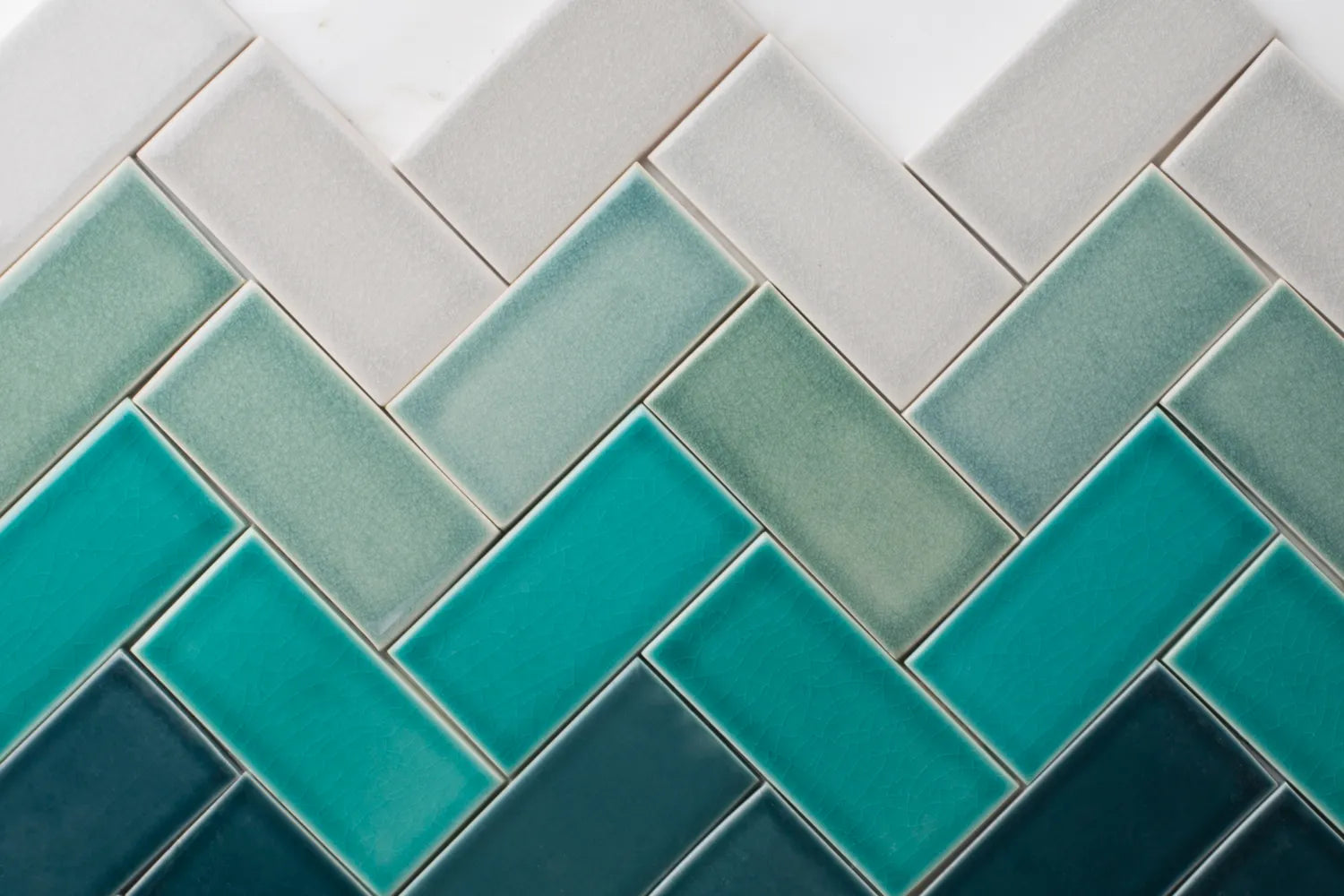
Rich petrol blue and bright white are bridged with the soft grey tile that ties the whole ombre backsplash together, made up of 6" hexagons with just a hint of well-scattered randomness to give the transitions a bit more flow.

Tile Shown: 6" Hexagon in Adriatic Sea Matte, Crater Lake Matte & Frost Matte // Design: Jkath Design Build + Reinvent // Image: Chelsie Lopez
2. Go Bold
There is fun to be had with this trend and you don’t have to be subtle about it. You can throw an unexpected color in the mix, go for an array of bold hues and you can also make your ombre less structured, using a bit of randomness in your arrangement to give your ombre even more sense of playfulness.
Giving the impression of moving water this bold office kitchen backsplash features 4 cascading colors of vertical 2x6 subway tile. An eye-catching design like this can turn a mundane space into a memorable one that colleagues will want to spend time in with one another.

Tile Shown: 2x6 in Lake Tahoe, Glacier Bay, Naples Blue & Adriatic Sea // Design: DGA San Diego // Image: Brian Doll
This bathroom to shower floor comprised of seven colors of 3" hexagon tile ranging from charcoal to saturated blues and greens has an almost digital appearance for a bold look to balance the more subdued white wall tile.

Tile Shown: 3" Hexagon in Gypsum, Salton Sea, Crater Lake Matte, Caribbean Matte, Nautical, Cyclone & Carbon // Design: Tom McElroy Architecture // Image: Rachel Styer
For a hexagon ombre like the shower installation above, you could try both 3" Hex or 4" Hex.
Interlocking Ogee Drop Tile starts off tonal in this laundry and powder room combo but switches to a bold contrast near the bottom to amplify the intrigue. The unique shape keeps the transitions soft and allows for pops of color while still maintaining its ombre appearance.

Tile Shown: Ogee Drop in Adriatic Sea, Cardamom, Chateau & Ivory // Design: Wraith Design // Image: Sen Creative
3. Stripes
While you would never want your hair to have a stripey ombre look, with tile, it's a good thing! This is where you can make the color progressions more pronounced and the fade from dark to light a bit less subtle.
Not all stripes would work for ombre. For instance, avoid alternating colors. Once you’ve moved on from a color, don’t reintroduce it in your pattern. Also, try to create a natural progression from shade to shade or brightness to brightness. Stripes will emphasize your ombre, but you still want a smooth gradient in your finished install.
With warm colors throughout this Miami restaurant, three distinct but complementary tones hit all the right notes across the bar wall.

Tile Shown: 4x4 in Koi, Haystack & Chateau // Design: Continuum Bazaar // Image: Thatch Miami
Another tonal ombre with noticeable color blocks, this shower features opaque matte glass tile in three shades of brown, capturing the colors of the mountains just outside.

Tile Shown: 4x4 in Chickadee Matte, Orielle Matte & Falcon Matte // Design: Harvest Moon Chalet // Image: Sterling Reed
Rather than segmented color blocking, you can choose several colors that slightly contrast, for a more bold, striped ombre.
This tile backsplash features well-defined color blocks of progressive brightness for a blocky ombre look that still flows perfectly.

Tile Shown: 3x3 sheeted in Ivory Gloss, Tuolumne Meadows, Sorbet & Mandarin // Design: Aker Interiors // Image: Jess Isaac Photography
Do you like any of the featured colors in this blog? Order samples online! Need some help? Simply call, chat, or fill out our Design Assistance Form and one of our talented Design Consultants will get back to you shortly.